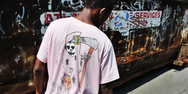
Everyone loves a great t-shirt. But what makes a t-shirt even more impressive is when you custom print your own design.
While you can always rush out to the store and buy your own t-shirts, there are custom print stores online like Vistaprint that allow you to design and print your own t-shirts.This way you can control the look and feel of your t-shirts.
The only problem is – creating your own designs isn’t always easy! From choosing the correct size to planning the best design there are a lot of considerations to make when printing your first shirts.
Here are our top 10 tips for better t-shirt designs.
Where to Print Your Designs
Before we get to our tips, you’ve got to find a place to design and print your t-shirts. We suggest checking out the online custom service Vistaprint. Thanks to their easy-to-use design platform, you can print your own t-shirts in just a few, simple steps.
Before you get printing, you’ve got to try a Vistaprint promo code! Any of these free promo codes will allow you to print amazing products at a discounted price.
10 Tips for Better T-shirt Printing
When people start off printing their t-shirts, they almost always go straight for the standard size. The problem is the standard size is often too big for most designs and it can overwhelm the look of your shirt. The bottom line is that size matters! Consider your t-shirt size carefully and remember that smaller is usually better.
- One size doesn’t fit all
Don’t forget that a t-shirt design won’t look exactly the same on every t-shirt. If you’re printing both large and small t-shirts, you’ll need to adapt your design to best match the shirt.
- Get the right placement
Remember that the standard place for your design is not right in the middle of your t-shirt, it’s actually around 4″ from the collar. This is a common mistake and it makes for a bad t-shirt design. Always choose your placement carefully as bad placement can lead to an awkward t-shirt.
Not all fonts are created equally! Choosing the appropriate font and making sure that your letters are spaced correctly results in an aesthetically pleasing t-shirt.
- Never use more than 3 fonts
Another general rule of thumb when dealing with typography is to never use more than 3 fonts in one design. If you pick too many different fonts, you’ll get a cluttered t-shirt that’s hard to read.
If your image quality is too low, usually under 200 dpi, you won’t have enough pixel information to produce a high quality image. This can lead to your design looking blurred and unclear. Choose a high quality image to ensure the best printing results.
It’s easy for your design to get washed out if you don’t choose the right color. It’s also an issue with budget as the more colors, the more expensive your design will be. If you need help choosing the right colors for your design, check out this guide on color theory.
Images that have contrasting colors make for the best designs. If you use too many dark or too many light colors in the same design, you risk your image setting being washed out. The contrast between light and dark colors creates an aesthetically pleasing design that’s easy to read.
- Avoid too much complexity
When you just get started printing, remember that it’s easier to work with simple designs. The human eye can only process information, so if your design is cluttered, it won’t translate well to print. Keep your design as simple as possible for best results.
- Avoid borders and edges
If you’re working with a photo, make sure you give it a border or an edge. Placing a square photo on a t-shirt often looks cheap, but adding a border to it gives it that professional touch.


